
5. Interior with a Goldfish Bowl, 1914 Matisse is one of the artists that just make me so happy that art exists. I feel satisfied just looking at his work and the colours and patterns etc. There’s that whole thing about the pleasure of painting and just basic visual pleasure, and Matisse epitomises that for me. Interior with a Goldfish Bowl was painted during the beginning of WWI at a time when Matisse was becoming more interested in Cubism and was making friends with Picasso and Juan Gris (as Spanish nationals, they were not subject to conscription, so remained in Paris). What I love the most about this painting is all the different blues in it and how tranquil it seems. Although he obviously uses certain Cubist concepts (rectilinear divisions, intersecting planes etc.) I really like how he doesn’t ~go all the way and we still get to be treated with this nice chunk of his studio. And those orange cigar fish lol.
4. The Black Fern, 1948
 Bright colour and pattern everywhere (dat spotted jaguar skin…). Love the scraggly paint application and the different approaches to the various parts of the painting. LOVE that black chunk of paint at the bottom in which he’s scratched his signature and the date (Venice, 1948 – and basically ~mattise waz here~). Many of Matisse’s late-life works are interiors that have been squished into one plane, so like in this one, although the floor and wall are separated through colour and pattern they share the same plane, so that the rectangular window showing a ‘view’ of some nice trees actually looks more like a painting itself. And that fern! It has more sass than the human figure in the painting.
3. My Room at the Beau-Rivage, 1917-18
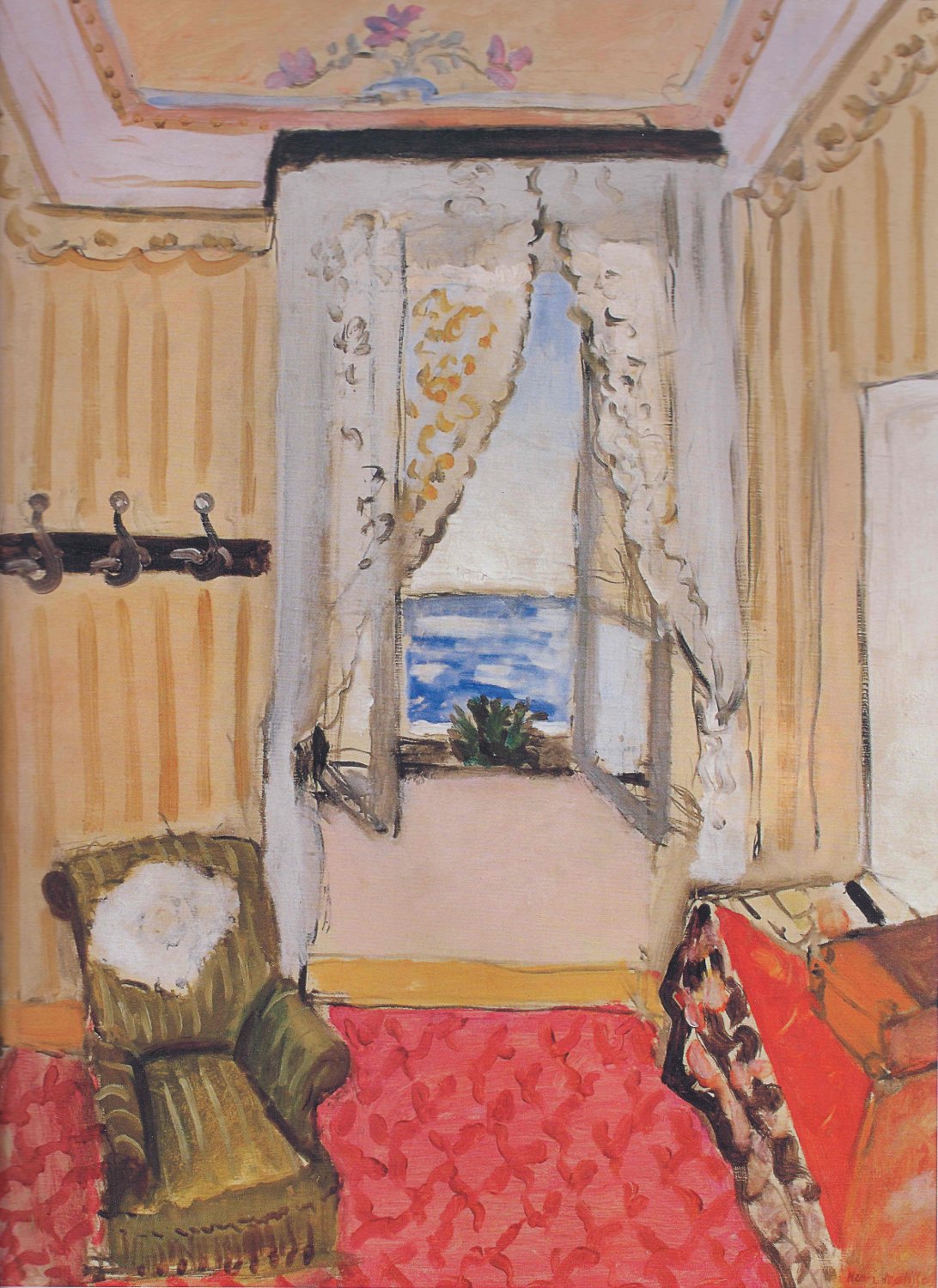 Apparently people were disappointed upon seeing the actual hotel room this painting depicts because it was nothing like Matisse’s inviting and cheery rendition. I like that he turned this default (and probs quite ugly) hotel room from something anonymous into a lovely painterly piece of candy. It’s just such an appealing and charming painting. It radiates light and colour and a kind of domesticated contentment.
2. The Pink Studio, 1911
 This was one of four massive paintings that were later named Matisse’s “grand symphonic interiors“… !!!! It’s a very all-over painting and the eye is free to move around at will and greedily suck everything up. There is definitely an aesthetic delight in this, like in so many of his other works. To me it seems very happy (that pink!), but I also like how he’s included so much of himself in it, even without depicting himself at all. Instead he shows us the things he was working on at the time. The book I was reading about him described it as a “parade” of his work in every medium and I think that’s totally fitting!
1. Harmony in Red, 1908
 This is my favourite painting of all time ever. That red with the electric blue… It’s pretty stubbornly two-dimensional, so everything seems to only just cling to the surface. Like I just want to reach in and pluck things out and eat them. Also the garden view could again be mistaken for a hanging painting. I personally really like the lovely, colouredy, patterny domesticity of this painting, but I learned that to draw attention away from the human element and the human action in the painting, Matisse renamed it Harmony in Red, to place emphasis on the formal elements of the painting, when it was originally called La Desserte – obviously referring to the figure placing fruit on the table. For me this painting basically defines the phrase ‘the pleasure of looking’ and fills me with happiness. It’s just full of painterly fizz. This was one of the paintings people living at the time really didn’t like (like much of the Fauvist works of many different artists), because it was too wild for them and thought of as ugly, but like whatever shows what they knew which is NOTHING.
